Learning Center
reading
Target automaticity with fonts and typestyles
february 15, 2010

One aspect of reading fluency is automaticity. Students see a word and just say it—they no longer have to sound it out. In the classroom, primary teachers work on this constantly, but what about reading in the real world. It’s hard to read a word if the font used is not the same as the Times New Roman and Comic Sans students see every day in the classroom.
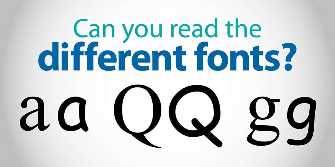
With all the computer fonts and graphic design programs out there, the same letter can look vastly different depending on the font choice. Children need to be familiar with many different visual forms of the same letter. For example, the letter “g” can look very different depending on the font.

And that’s just the lowercase letter. Don’t forget there are many version of the uppercase, too.

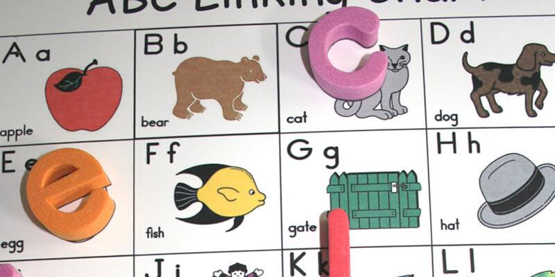
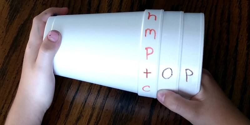
Real-world text is often manipulated in a way that makes it look like a foreign language. Teach students to recognize the different looks for the same letter. Encourage students to bring in letter samples from home. Have them cut letters from the dog food bag, cereal boxes, shoe boxes, etc. When they bring them in, laminate them for durability. Then, add an activity to your literacy workstation/center. Model how to sort the letters, both upper and lowercase. (Put all the version of upper and lowercase “g” together. Put all the version of “b” together, etc.)


